The University of Massachusetts Amherst
Categories
Uncategorized

Sometimes it just takes a pen and a board

PowerPoint and Keynote can give you easy access to images, effects, and animations. But sometimes the simple act of drawing it out on the board can still be the best way to teach. Check out this presentation on the current economic crisis in this presentation by Marketplace Senior Editor Paddy Hirsch. It is very simple, yet it the clarity of his words and his images make the topic very accessible.

[kml_flashembed movie="http://www.youtube.com/v/eb_R1-PqRrw" width="425" height="350" wmode="transparent" /]
Categories
Presentations

Example: Common Craft Presentations

I love these examples of picture-rich presentations from Common Craft. Although it could all be done in PowerPoint with clip art (or worse, bullet lists), he does it all with very simple drawings on cut paper. The obvious use of hands and string to provide animation “effects” is especially charming and a welcome stick in the eye of the assumption that all presentations have to be “slick”.

Take a look at his presentation on Flickr:

[kml_flashembed movie="http://www.youtube.com/v/vPU4awtuTsk" width="425" height="350" wmode="transparent" /]

Categories
Presentations

How to Tell if You Have a Bad Presentation

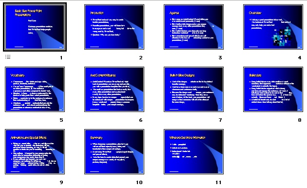
The first way to tell if your presentation will put ’em to sleep is to view it in the “Slide Sorter” view. If all the slides look the same in this view, start dumping the text and adding pictures. Presentations such as these eventually become visual white noise for the audience. After a while, they will either stop reading the slides, or even noticing when the slides change.

Image of many identical slides in Slide View

Eventually, this endless procession of bland text blocks becomes the visual equivalent of hundreds of miles of cornfields, viewed through the window of a family station wagon on a long trip. In fact, I wouldn’t be surprised if someone in the back row started asking “Are we there yet?” every minute or so.